Making my presentation – part two

(Part one is here)

After I had my draft structure done I had to distribute the content along a 10-minutes’ timeline, because I had only 10 minutes for my presentation. Actually, I had 10-12 minutes, but I decided to leave 2 minutes as a reserve in case something goes wrong.

Now the process of distributing all I wanted to say properly was a real challenge. In order to make it easier, I first drafted a timeline in my notebook.

timeline

Then I typed the text word by word and tried to read it with a stopwatch. Although I managed to fit it into the time frame (at the third attempt), I realized that I have to make it even shorter and, what is most important, to get rid of syntactically complicated constructions. So I ended up having a text divided into parts according to my presentation slides with 3 to 8 sentences for each slide.

Ah yes, regarding slides. Well, I decided not to use the colour scheme I was testing in the previous post, because it seemed to me boring. Instead I took this one by plamenj, which looks like this:

2013-06-23 01_41_53-COLOURlovers.com - Gamebookers

And here’s my presentation at Slideshare (actually longer than it used to be, because I split the animated slides made in PowerPoint into separate slides, as Slideshare doesn’t read animation).

It is originally in Russian of course, but I translated it.

Also, thanks to Jakes from my wonderful Team 10, because he sent me very helpful materials regarding designing presentation. And thanks to Irina (from the same team among all) for also sharing materials and generally being extremely encouraging.

By the way, I found out that PowerPoint and SlideShare are badly compatible. So I had to do some extra editing to make it look similar to its initial ppt version. Maybe next time I’ll try playing with Google and Libre Office equivalents, as well as Presi.com. But hopfully, not too soon, because I want to get back to the wonderful Python MOOC, which has already begun. The 1st week’s tasks don’t look too challenging, but there’s a bunch of some new information that I want to digest before I receive the next portion of tasks.

Data Expedition Recap

I can hardly believe it, but my assignment at School of Data seems to be completed. The last step was to produce some output, that is to tell the story. Now I think I should somehow summarize my experience.

Now, first off, what is Data Expedition at School of Data? It can be very flexible in terms of organisation. Here are the links to the general description and also to the Guide for Guides, which is revealing. In this post, I’ll be talking about this particular expedition. Also, a great account of it can be found on one of my team mates’ blog. So, this expedition was technically very similar to the principle of Python Mechanical MOOC. All the instructions were sent by a robot via our mailing list and then we had to collaborate with our team mates to find solutions.

8364602336_facaa10cdf_o

(Image CC-By-SA J Brew on Flickr)

First of all, we were given a dataset on CO2 emissions by country and CO2 emissions per capita. Our task was to look at the data and try to think about what can be done about it. As a background, we were also given the Guardian article based on this very dataset so that we could have a look at a possible approach. Well, I can’t say I was able to do the task right away. Without any experience of working

with data or any tools to deal with it, I felt absolutely frustrated by the very look of a spreadsheet. And at that stage peers could hardly provide any considerable technical support, because we all were newbies.

2013-06-03 01_13_18-Untitled - Google Maps

Then we had tasks to clean and format the data in order to analyze certain angles. Here our cooperation began and became really helpful. Although nobody among us was an expert here, we were all looking for the solutions and shared our experience, even when it was little more than ‘I DON’T UNDERSTAND ANYTHING!!11!!1!’.

Our chief weapons were:

  • the members’ supportive and encouraging attitude to each other
  • our mailing list
  • Google Docs to record our progress
  • Google Spreadsheets to work with our data and share the results
  • Google Hangout for our weekly meet-ups (really helpful, to my mind)
  • Google Fusion Tables for visualisation (alongside with Google Spreadsheets)

And that is it actually. I’m not mentioning more individual choices, because I’m not sure I even know about them all.

Now some credits.

Irina, you’ve been a source of wonderful links that really broadened my understanding of what’s going on. And above all, you’re extremely encouraging.

Jakes, you’ve contributed a huge amount of effort to get the things going and I think it paid off. You have also always been very supportive, generous and helpful even beyond the immediate team agenda.

Ketty, you were the first among us who was brave enough to face the spreadsheet as it is and proved that it is actually possible to work with. I was really inspired by this and tried to follow suit. Same was in the case of Google Fusion Tables.

Randah, I wish you had had more time at your disposal to participate in the teamwork. And judging by your brief inputs, you would make a great team mate. You were also the person who coined the term dataphobia and in this way located the problem I resolved to overcome. I hope to get in touch with you again when you have more spare time.

Zoltan, you were also an upsettingly rare contributor, due to your heavy and unpredictable workload. But nevertheless, you managed to provide an example of a very cool approach to overcoming big problems just by mechanically splitting them into smaller and less scary pieces.

Vanessa Gennarelli and Lucy Chambers, thanks for organising this wonderful MOOC!

So, as a result, I

  • seem to have overcome my general dataphobia
  • learnt a number of basic techniques
  • got an idea of what p2p learning is (it’s a cool thing, really)
  • got to know great people and hope to keep collaborating with them in the future

Well, this is kind of more than I expected.

Next, I’m going to learn more about data processing, Python, P2P-learning and other awesome things.

My first data-driven story ever

As this WordPress blog doesn’t want to embed interactive visualisations, I’ll publish the full story at Blogspot. This is actually the final challenge of the Data Expedition at School of Data, in which I was lucky to participate. I had to present the results of my data experiments as a data-driven story.

Any instructive feedback, recommendations and criticisms are welcome, because it’s really hard to assess this stuff from my beginner’s position. Also, if you notice any mistakes, which, I’m sure, are numerous, please let me know.

So, below is actually the story. And here’s the full dataset behind the story.

There was an article by Simon Rogers and Lisa Evans on Guardian Datablog, which showed that if we compare the pure CO2 emissions data and the data on CO2 per capita emissions, we can see strikingly different results. The starting point of this analysis was that the “world where established economies have large – but declining – carbon emissions. While the new economic giants are growing rapidly” [in terms of CO2 emissions volume again]. But if we look at the CO2 per capita data, we can see that those rapidly growing economic giants have very modest results, compared to the USA, as well as some really small economies like Qatar or Bahrain.

I decided to have closer look at the data on pure CO2 emissions, CO2 emissions per capita, as well as GDP, in order to see if there are any patterns. Namely, if there is any relationship between GDP growth and CO2/CO2 per capita emissions volume. The general picture can be seen on the interactive visualisation at Blogspot or here. (Honestly, I don’t know why this Google chart prefers to speak Russian when published. Actually, the Russian phrase in the chart’s navigation means ‘same size’.) It is based on the data for the top-10 CO2 emitters combined with top-10 CO2 per capita emitters (only those though, for which WB data on GDP had some information) and actually the GDP data for the period from 2005 to 2009, which was the optimal range in terms of data availability. Plus South Africa for the reasons described below.

Now, is there any relationship between GDP growth (or decline) and the amount of CO2 emissions? Here are some observations.

During the period of 2005 – 2008, all of the presented economies were growing, after which there was a massive decline in the economic growth, quite predictably, because the global economic crisis began in 2008. And we can see a corresponding massive decline of the amounts of CO2 emissions. Generally speaking, by 2008, about 30% of the total of the 21 countries had CO2 emissions growth rate below 100%. After 2008, it was about 60% of the total that had CO2 emissions growth rate below 100%.

Can we really insist that it was only the global economic decline that provoked this decline in CO2 emissions, and not, for example, the results of some green policies? Well, our data doesn’t provide enough information to draw this conclusion. But there is a peculiar thing to mention though.

After 2008, there were actually some economies (again, of our sample list) that continued to grow, namely, China, India, Japan, Singapore, and South Africa. The corresponding CO2 emissions indicators, in terms of growth or declination, are rather different, as can be seen below.
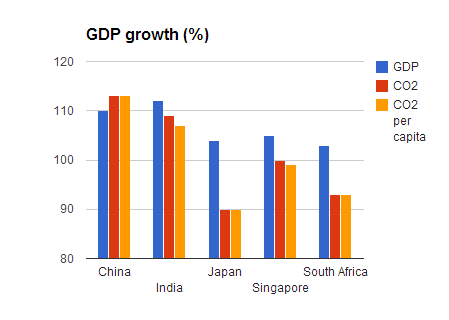
chart1

And also, there are five economies that had a considerable GDP decline, but nonetheless a stable CO2 emissions growth.
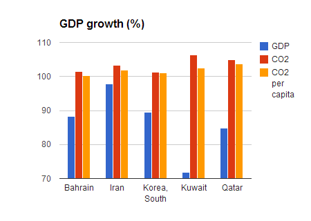
chart2

Now, if we look at these ten countries together, we shall see that only in three cases (Japan, Singapore and South Africa) GDP growth is accompanied by CO2 emissions decline. While in the other cases, CO2 emissions keep increasing without any obvious connection to the GDP trends.

***

Last thing I would want to mention is a very general observation. Just for the sake of it, I compared my initial CO2 emissions dataset from U.S. Energy Information Administration (EIA)  with another one (Carbon Dioxide Information Analysis Center (CDIAC)).

Here are the total values of the two datasets:

chart4

And here’s the total world GDP, according to the data from the World Bank and IMF. These look much more similar (as well as up-to-date):

chart5

This basically goes in accord with the observation that governments are paying less attention to the information on CO2 concentration in the atmosphere.

Another observation is that although the total trends in the two CO2 datasets seem to be non-contradictory (even though different) in general, it doesn’t mean that there are no contradictions in some particular cases. For instance, if we look at the top-10 CO2 emitters in both EIA and CDIAC datasets as of 2009, we can see that in CDIAC dataset South Africa takes the tenth position, while in the EIA dataset South Africa is in the twelfth position. Which when visualised shows contradictory trends: according to CDIAC, the volume of CO2 emissions from South Africa increases, and according to EIA, it goes down.
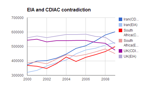
chart3

Visualisation progress

Trends GoogleDone it! By a pure chance, but I seem to have done it! An interactive Google visualisation of my data, which shows the correlation between CO2 emissions volume and GDP growth. Could be better and more detailed, I know, but wow, I didn’t even realize Google is really capable of it or I’m really capable of squeezing it from Google.

Now, some details. First, due to a very complicated relationship between WordPress.com and embeddable stuff, I can’t publish it here. I can only provide a link to where this interactivity is available. So, here’s the original spreadsheet with both the data and chart. And here’s my attempt (successful this time) to embed the chart into blogspot. And it was really a happy coincidence that I got this result, because I didn’t know how to do it. What I was actually trying to do is to shape my data so that it can be processed in Tableau Public. And it wouldn’t work.

Then I realized that TP isn’t free software (only a 14 days’ trial version is free), which immediately made it rather unattractive im my eyes.

UPD: A commentator has kindly corrected me. Tableau has both free and paid versions (and the 14 day’s trial is for the latter). Tableau Public is free.

Today I tried to visualise this chart in Google Spreadsheets and here’s the result. So, our chief weapons are the tools used: Data Wrangler (free) and Google Spreadsheets (also free).

If somebody has any instructive tips or critisisms, I’ll be delighted to hear them.

Data journalism: Learning insights

Today my learning is focused on data journalism (I’ve got to finish my story as a challenge within Data Expedition). And also, today I decided to have a look at the product rather than the technique, as I previously did. To this end, I went to read Guardian Datablog and it seems to be quite an enlightening experience.

But first off, I have to give credit to Kevin Graveman, whose post actually provoked me to think in this direction. Kevin gave some tips on learning CSS by looking at both HTML and CSS sources of a page and also comparing it to the way the page looks in order to better understand how it works.
Now, this approach (quite natural, but not always obvious) can be replicated in many other areas. So today, I’m applying it to The Guardian by learning the anatomy of their data driven materials (just as if I was looking at the source code of their product). And I’m also making notes about my observations on the way.

  1. They ALWAYS provide links to their datasets. Under each piece of visualisation, they post a link to a small particular spreadsheet with the data regarding this piece.
  2. After the article they also provide a link to the full spreadsheet.
  3. A spreadsheet contains not only data, but also notes (on a separate sheet) with sources and some explanations. Like so  (for this article).
  4. Guardian Datablog is a great source of datasets. Although somewhat random.
  5. But these datasets are not always very trustworthy.
  6. Their visualisations are normally interactive.
  7. Some entries to the blog are very short in terms of writing, but provide complicated visualisations. Others rely on text substentially.
  8. Most underlying datasets in the materials I’ve seen are organised as single Google spreadsheets with several sheets (or tabs) containing particular spreadsheets. A good example is a recent Simon Rogers and Julia Kollewe’s material. The dataset is here.
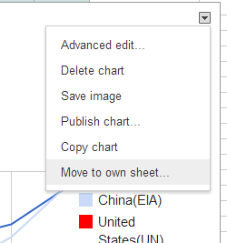
  9. It seems to be a good idea to place some charts on separate sheets. (In order to do this, l-click the chart anywhere to open the quick edit mode, then hit the small triangle in the top corner on the right and choose ‘move to own sheet’.)

move chart

Building a network

Social media are great, because they are omnipresent, fast, easy to handle, good for getting in touch with people, monitoring news and accumulating multiple sources of information. But I genuinely love blogs, exactly because they are slower and more fundamental. And I’m sure they’ve got a huge p2p collaboration and networking potential (alongside with other tools of course – e.g. Wiki or Google Docs). That’s why I liked the Webcraft 101 idea to create such a p2p blogging community. It can be built from scratch of course and this process can be facilitated by searching for people through specialised places like P2PU or even Getstudyroom. But I thought it could also be a good thing for staying in touch and collaboration with already existing peers.

Now, this is exactly my case. For more than a month know, I’ve been learning and working in a team within a Data Expedition. And it happened so that this teamwork has been actually the best thing in the entire process. School of data is a wonderful project and Data Expeditions are really an awesome idea, but also a very challenging one in terms of implementation. I can’t say everything is perfectly organised – it’s a pilot version after all. But I was lucky to get into a team that actually made up for all the organisational shortcomings. And also for the first time gave me a sense of a p2p learning process.

Team10

The Data Expedition is going to be over soon. But it doesn’t mean that the teamwork is going to finish, especially as some team members expressed their willingness to stay in touch and continue our cooperation. So blogging might become an important part of such long-term collaboration process. I hope it will. Anyway, why not try. I’ve already followed one of our team members’ new-born blog, which I will promote as soon asI find out that tis blog’s author doesn’t mind.

Well, that said, I must admit that this week I haven’t learnt as much technical stuff as I’d want to. But instead I’ve learnt quite a bit of new things about building online cooperation communities.

And I’ve also been trying to code every day – that is to spend at least 15 minutes by solving tasks at Codecademy. They say it is kind of important in order to learn something. I do hope it helps! OK, we’ll see. Anyway, it’s fun.