Briefly

1. I’m still alive.

2. I keep working as a journalist. Recently I’ve actually tried applying my newly acquired skills to my real job. Still much to work on, but at least I seem to have learnt at least something. In the first case I tried to work with some data on death penalty in the US; in the second case, I was visualising some aspects (namely, on kidnapping) of Global Terrorism Database. Both materials are in Russian of course. Moreover, the website does currently not allow for embedding interactive visualisations, so there are only screenshots, while the original interactive stuff is published on my Blogger account (but again, in Russian). Speaking of Global Terrorism Database, there’s a whole course at Coursera based on this project. Don’t know much about it, so I can’t recommend it, but I’ll definitely have a look, as soon as I can.

3. I keep tracking the developments in the activity of Open Data School in Moscow. It’s an interesting project both as an educational initiative and as part of promoting openness. More on it later, as well as on DLMOOC, by the way, which is fascinating (sadly, I’ve been virtually unable to participate full-scale).

4. Meanwhile, I’m trying to keep up with Linear Algebra: Foundation to Frontiers and Statistical Learning.

5. Right now I’m in the middle of running yet another Russian-language data expedition (DE3), which began on 20 February. This one is a bit different from DE1 and DE2. First, we this time we (Irina Radchenko and myself from Datadrivenjournalism.ru) worked in partnership with Aleksey Sidorenko from NGO “Теплица социальных технологий” (Teplitsa/Greenhouse of Social Technologies). It is also the first time that we have taken a socially meaningful subject, which is orphan diseases. DE3 is going to finish on March 5. Soon after, I’ll be able to tell more about it, as well as about its findings (we’re digging the data on the situation in Russia in the first place). By the way, it will also be great to have some kind of feedback from people from other countries who are aware of the local situation (Jakes?).

6. Last, but not least, I’m currently involved (unfortunately in quite a hybernating way at the moment) in developing an international project on national informational resources. It all started with Team 10, but it’s going to grow. More on it later.

Still alive

I think this is the busiest summer I’ve ever had in my life. I’m trying hard to follow my schedule, but not always successfully. Thanks to Python MOOC’s organisers who havekindly  included a week’s break in the middle of the sequence and now I hope to cover week 4 before the next bunch of tasks arrives. I’ll soon post some updates on my findings and experiences.

For now I’ll just save a couple of links here:

This is where MIT OCW hometasks (assignments) can be downloaded. I just keep losing this page. Now I seem to have fixed it.

2013-07-17 04_07_03-Edward Tufte_ Books - The Visual Display of Quantitative Information

And another link, which is not about Python, but I thought it might be interesting for some of my peers. It’s The Visual Display of Quantitative Information by Edward R. Tufte. The shortcoming is that the book is not free. Well, at least it is not supposed to be. Anyway, it was recommended by a person whose judgement I trust here.

Also (just boasting) we’re starting an experimental one week’s long data-MOOC (or data-expedition) in Russian in less than a week’s time. The subject will also be very narrow: we’ll only have to learn different ways of searching for data. I really wonder what it’ll turn to be like. What I know for sure is that it’s going to be a huge pile of various information in addition to Python and my job. And there’ll have to be some additional analytical work afterwards, because we’ll have to sum up our results and understand what we’ll have to improve in its future iterations. The question is how I’m going to find time for all this. But I’ll have to.

Preparing the first presentation in my life

This is supposed to be a complaining post. But I’ll also try to make it somehow useful at least due to the links to helpful resources I find on the way. Now, to the point. As I have already mentioned (more than once, I think), I hate visual stuff. And presentations today are all based on slides, so I’ve got to not only think about the structure and opening and closing and hooks for the audience, but also about making some decent background for my presentation.

So, learning again.

A couple of words about the circumstances. I’ve got to prepare this presentation for a conference on social computing that takes place in Moscow this Friday (on 21 June) and my topic is data journalism. Although I’ve got, say, 3 days ahead, I’m very short of time, because during these days I’ll also have to work and learn etc. So my most immediate target is to make at least a draft presentation to have some back-up in case I’m overwhelmed by work during the week.

So, first thing I did, I went web-hunting to find some tips on what to do. And here’s what I’ve found instructive so far.

Now, in order to start the process, I decided to create some structure. And in order to do this, in turn, I first put down some information blocks in order to later arrange them more logically.

Here’s what I’ve got in the end:

data_journalism_copy_small

Feel free to see this monster full-size.

And I was actually testing this palette by GlueStudio (which I downloaded from ColourLovers I mentioned above).

2013-06-18 03_02_33-COLOURlovers.com - Terra_

OK, next I’ll have to fit all this into like 5 slides (I’ve got no more than 12 minutes for my presentation).

Data Expedition Recap

I can hardly believe it, but my assignment at School of Data seems to be completed. The last step was to produce some output, that is to tell the story. Now I think I should somehow summarize my experience.

Now, first off, what is Data Expedition at School of Data? It can be very flexible in terms of organisation. Here are the links to the general description and also to the Guide for Guides, which is revealing. In this post, I’ll be talking about this particular expedition. Also, a great account of it can be found on one of my team mates’ blog. So, this expedition was technically very similar to the principle of Python Mechanical MOOC. All the instructions were sent by a robot via our mailing list and then we had to collaborate with our team mates to find solutions.

8364602336_facaa10cdf_o

(Image CC-By-SA J Brew on Flickr)

First of all, we were given a dataset on CO2 emissions by country and CO2 emissions per capita. Our task was to look at the data and try to think about what can be done about it. As a background, we were also given the Guardian article based on this very dataset so that we could have a look at a possible approach. Well, I can’t say I was able to do the task right away. Without any experience of working

with data or any tools to deal with it, I felt absolutely frustrated by the very look of a spreadsheet. And at that stage peers could hardly provide any considerable technical support, because we all were newbies.

2013-06-03 01_13_18-Untitled - Google Maps

Then we had tasks to clean and format the data in order to analyze certain angles. Here our cooperation began and became really helpful. Although nobody among us was an expert here, we were all looking for the solutions and shared our experience, even when it was little more than ‘I DON’T UNDERSTAND ANYTHING!!11!!1!’.

Our chief weapons were:

  • the members’ supportive and encouraging attitude to each other
  • our mailing list
  • Google Docs to record our progress
  • Google Spreadsheets to work with our data and share the results
  • Google Hangout for our weekly meet-ups (really helpful, to my mind)
  • Google Fusion Tables for visualisation (alongside with Google Spreadsheets)

And that is it actually. I’m not mentioning more individual choices, because I’m not sure I even know about them all.

Now some credits.

Irina, you’ve been a source of wonderful links that really broadened my understanding of what’s going on. And above all, you’re extremely encouraging.

Jakes, you’ve contributed a huge amount of effort to get the things going and I think it paid off. You have also always been very supportive, generous and helpful even beyond the immediate team agenda.

Ketty, you were the first among us who was brave enough to face the spreadsheet as it is and proved that it is actually possible to work with. I was really inspired by this and tried to follow suit. Same was in the case of Google Fusion Tables.

Randah, I wish you had had more time at your disposal to participate in the teamwork. And judging by your brief inputs, you would make a great team mate. You were also the person who coined the term dataphobia and in this way located the problem I resolved to overcome. I hope to get in touch with you again when you have more spare time.

Zoltan, you were also an upsettingly rare contributor, due to your heavy and unpredictable workload. But nevertheless, you managed to provide an example of a very cool approach to overcoming big problems just by mechanically splitting them into smaller and less scary pieces.

Vanessa Gennarelli and Lucy Chambers, thanks for organising this wonderful MOOC!

So, as a result, I

  • seem to have overcome my general dataphobia
  • learnt a number of basic techniques
  • got an idea of what p2p learning is (it’s a cool thing, really)
  • got to know great people and hope to keep collaborating with them in the future

Well, this is kind of more than I expected.

Next, I’m going to learn more about data processing, Python, P2P-learning and other awesome things.

My first data-driven story ever

As this WordPress blog doesn’t want to embed interactive visualisations, I’ll publish the full story at Blogspot. This is actually the final challenge of the Data Expedition at School of Data, in which I was lucky to participate. I had to present the results of my data experiments as a data-driven story.

Any instructive feedback, recommendations and criticisms are welcome, because it’s really hard to assess this stuff from my beginner’s position. Also, if you notice any mistakes, which, I’m sure, are numerous, please let me know.

So, below is actually the story. And here’s the full dataset behind the story.

There was an article by Simon Rogers and Lisa Evans on Guardian Datablog, which showed that if we compare the pure CO2 emissions data and the data on CO2 per capita emissions, we can see strikingly different results. The starting point of this analysis was that the “world where established economies have large – but declining – carbon emissions. While the new economic giants are growing rapidly” [in terms of CO2 emissions volume again]. But if we look at the CO2 per capita data, we can see that those rapidly growing economic giants have very modest results, compared to the USA, as well as some really small economies like Qatar or Bahrain.

I decided to have closer look at the data on pure CO2 emissions, CO2 emissions per capita, as well as GDP, in order to see if there are any patterns. Namely, if there is any relationship between GDP growth and CO2/CO2 per capita emissions volume. The general picture can be seen on the interactive visualisation at Blogspot or here. (Honestly, I don’t know why this Google chart prefers to speak Russian when published. Actually, the Russian phrase in the chart’s navigation means ‘same size’.) It is based on the data for the top-10 CO2 emitters combined with top-10 CO2 per capita emitters (only those though, for which WB data on GDP had some information) and actually the GDP data for the period from 2005 to 2009, which was the optimal range in terms of data availability. Plus South Africa for the reasons described below.

Now, is there any relationship between GDP growth (or decline) and the amount of CO2 emissions? Here are some observations.

During the period of 2005 – 2008, all of the presented economies were growing, after which there was a massive decline in the economic growth, quite predictably, because the global economic crisis began in 2008. And we can see a corresponding massive decline of the amounts of CO2 emissions. Generally speaking, by 2008, about 30% of the total of the 21 countries had CO2 emissions growth rate below 100%. After 2008, it was about 60% of the total that had CO2 emissions growth rate below 100%.

Can we really insist that it was only the global economic decline that provoked this decline in CO2 emissions, and not, for example, the results of some green policies? Well, our data doesn’t provide enough information to draw this conclusion. But there is a peculiar thing to mention though.

After 2008, there were actually some economies (again, of our sample list) that continued to grow, namely, China, India, Japan, Singapore, and South Africa. The corresponding CO2 emissions indicators, in terms of growth or declination, are rather different, as can be seen below.

chart1

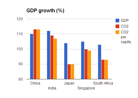
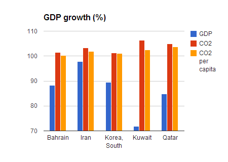
And also, there are five economies that had a considerable GDP decline, but nonetheless a stable CO2 emissions growth.

chart2

Now, if we look at these ten countries together, we shall see that only in three cases (Japan, Singapore and South Africa) GDP growth is accompanied by CO2 emissions decline. While in the other cases, CO2 emissions keep increasing without any obvious connection to the GDP trends.

***

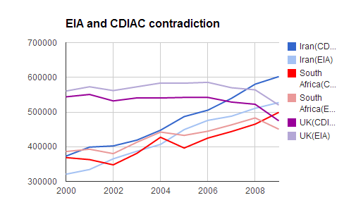
Last thing I would want to mention is a very general observation. Just for the sake of it, I compared my initial CO2 emissions dataset from U.S. Energy Information Administration (EIA)  with another one (Carbon Dioxide Information Analysis Center (CDIAC)).

Here are the total values of the two datasets:

chart4

And here’s the total world GDP, according to the data from the World Bank and IMF. These look much more similar (as well as up-to-date):

chart5

This basically goes in accord with the observation that governments are paying less attention to the information on CO2 concentration in the atmosphere.

Another observation is that although the total trends in the two CO2 datasets seem to be non-contradictory (even though different) in general, it doesn’t mean that there are no contradictions in some particular cases. For instance, if we look at the top-10 CO2 emitters in both EIA and CDIAC datasets as of 2009, we can see that in CDIAC dataset South Africa takes the tenth position, while in the EIA dataset South Africa is in the twelfth position. Which when visualised shows contradictory trends: according to CDIAC, the volume of CO2 emissions from South Africa increases, and according to EIA, it goes down.

chart3

Visualisation progress

Trends GoogleDone it! By a pure chance, but I seem to have done it! An interactive Google visualisation of my data, which shows the correlation between CO2 emissions volume and GDP growth. Could be better and more detailed, I know, but wow, I didn’t even realize Google is really capable of it or I’m really capable of squeezing it from Google.

Now, some details. First, due to a very complicated relationship between WordPress.com and embeddable stuff, I can’t publish it here. I can only provide a link to where this interactivity is available. So, here’s the original spreadsheet with both the data and chart. And here’s my attempt (successful this time) to embed the chart into blogspot. And it was really a happy coincidence that I got this result, because I didn’t know how to do it. What I was actually trying to do is to shape my data so that it can be processed in Tableau Public. And it wouldn’t work.

Then I realized that TP isn’t free software (only a 14 days’ trial version is free), which immediately made it rather unattractive im my eyes.

UPD: A commentator has kindly corrected me. Tableau has both free and paid versions (and the 14 day’s trial is for the latter). Tableau Public is free.

Today I tried to visualise this chart in Google Spreadsheets and here’s the result. So, our chief weapons are the tools used: Data Wrangler (free) and Google Spreadsheets (also free).

If somebody has any instructive tips or critisisms, I’ll be delighted to hear them.

Struggling with visualisation

I wasn’t going to post anything today, but now I see I’ll have to just for the sake of saving what I’ve learnt about data visualisation, which now seems to me the most challenging part of my beginner’s data manipulation. My target now is to make a story based on the CO2 emissions data. I have already played with two CO2 datasets and found out that some values are rather different. For instance, when I compared the top-10 CO2 emitters (in 2009, that is the latest year, for which CO2 emissions data is available) from two datasets (EIA and UN), I found not only certain differences, but also one obvious contradiction regarding South Africa. I’m not sure it’s really meaningful, but well, the lines obviously show contradictory trends for this particular country:

SA_chart

I have also noticed, by comparing IMF and WB data on GDP, that this kind of data is much more accurate than in the case of CO2. By accurate, I actually mean more similar. And more up-to-date, for that matter.

OK, that was the easiest part in fact. Next I’ve been trying to do some more visualisation using Tableau Public. With the help of visualisation, I want to find out whether there is any correlation between GDP growth and CO2 emissions volume; and I want to compare this correlation to that of GDP and CO2 per capita (which is strikingly different from CO2 emissions by country).

The key problem here is to format the spreadsheet correctly, so that it can be processed in Tableau Public. I haven’t done it yet and I’m not sure I’ll manage to tonight, so I just want to save a couple of links and tips for the future.

First, there’s a cool tool for data cleaning and shaping. It’s called Data Wrangler. You don’t have to download it, it works in your browser.

Second, Tableau Public website has a wonderful gallery of brilliant visualisations. They call it a source of inspiration. I’d rather call it a fascinating source of learning materials. You can download any visualisation you like and then extract the data from there and see how it’s shaped. And also, some authors tell how they did it. Among others, there’s a complicated interactive visualisation by Alex Kerin, which I downloaded as a sample and which I’m currently trying to analyse.

Data journalism: Learning insights

Today my learning is focused on data journalism (I’ve got to finish my story as a challenge within Data Expedition). And also, today I decided to have a look at the product rather than the technique, as I previously did. To this end, I went to read Guardian Datablog and it seems to be quite an enlightening experience.

But first off, I have to give credit to Kevin Graveman, whose post actually provoked me to think in this direction. Kevin gave some tips on learning CSS by looking at both HTML and CSS sources of a page and also comparing it to the way the page looks in order to better understand how it works.
Now, this approach (quite natural, but not always obvious) can be replicated in many other areas. So today, I’m applying it to The Guardian by learning the anatomy of their data driven materials (just as if I was looking at the source code of their product). And I’m also making notes about my observations on the way.

  1. They ALWAYS provide links to their datasets. Under each piece of visualisation, they post a link to a small particular spreadsheet with the data regarding this piece.
  2. After the article they also provide a link to the full spreadsheet.
  3. A spreadsheet contains not only data, but also notes (on a separate sheet) with sources and some explanations. Like so  (for this article).
  4. Guardian Datablog is a great source of datasets. Although somewhat random.
  5. But these datasets are not always very trustworthy.
  6. Their visualisations are normally interactive.
  7. Some entries to the blog are very short in terms of writing, but provide complicated visualisations. Others rely on text substentially.
  8. Most underlying datasets in the materials I’ve seen are organised as single Google spreadsheets with several sheets (or tabs) containing particular spreadsheets. A good example is a recent Simon Rogers and Julia Kollewe’s material. The dataset is here.
  9. It seems to be a good idea to place some charts on separate sheets. (In order to do this, l-click the chart anywhere to open the quick edit mode, then hit the small triangle in the top corner on the right and choose ‘move to own sheet’.)

move chart

Tableau Public: trying out

My first visualisation ever. Just tested a tool. It’s called Tableau Public and it’s free.

Could be better, but practice makes perfect as they usually say in these cases. TP is really cool. But I can’t embed it into this blog, because:

There is also a service called www.WordPress.com which lets you get started with a new and free WordPress-based blog, but it is less flexible than the WordPress you download and install yourself. Blogs hosted on WordPress.com do not take advantage of tools like Tableau that use JavaScript.

(TP FAQ)

OK. Here’s a screenshot preview.

Workbook  TEST

And here’s its interactive version.

And now I’ll go’ n’ kill myself.