Still alive

I think this is the busiest summer I’ve ever had in my life. I’m trying hard to follow my schedule, but not always successfully. Thanks to Python MOOC’s organisers who havekindly  included a week’s break in the middle of the sequence and now I hope to cover week 4 before the next bunch of tasks arrives. I’ll soon post some updates on my findings and experiences.

For now I’ll just save a couple of links here:

This is where MIT OCW hometasks (assignments) can be downloaded. I just keep losing this page. Now I seem to have fixed it.

2013-07-17 04_07_03-Edward Tufte_ Books - The Visual Display of Quantitative Information

And another link, which is not about Python, but I thought it might be interesting for some of my peers. It’s The Visual Display of Quantitative Information by Edward R. Tufte. The shortcoming is that the book is not free. Well, at least it is not supposed to be. Anyway, it was recommended by a person whose judgement I trust here.

Also (just boasting) we’re starting an experimental one week’s long data-MOOC (or data-expedition) in Russian in less than a week’s time. The subject will also be very narrow: we’ll only have to learn different ways of searching for data. I really wonder what it’ll turn to be like. What I know for sure is that it’s going to be a huge pile of various information in addition to Python and my job. And there’ll have to be some additional analytical work afterwards, because we’ll have to sum up our results and understand what we’ll have to improve in its future iterations. The question is how I’m going to find time for all this. But I’ll have to.

Visualisation progress

Trends GoogleDone it! By a pure chance, but I seem to have done it! An interactive Google visualisation of my data, which shows the correlation between CO2 emissions volume and GDP growth. Could be better and more detailed, I know, but wow, I didn’t even realize Google is really capable of it or I’m really capable of squeezing it from Google.

Now, some details. First, due to a very complicated relationship between WordPress.com and embeddable stuff, I can’t publish it here. I can only provide a link to where this interactivity is available. So, here’s the original spreadsheet with both the data and chart. And here’s my attempt (successful this time) to embed the chart into blogspot. And it was really a happy coincidence that I got this result, because I didn’t know how to do it. What I was actually trying to do is to shape my data so that it can be processed in Tableau Public. And it wouldn’t work.

Then I realized that TP isn’t free software (only a 14 days’ trial version is free), which immediately made it rather unattractive im my eyes.

UPD: A commentator has kindly corrected me. Tableau has both free and paid versions (and the 14 day’s trial is for the latter). Tableau Public is free.

Today I tried to visualise this chart in Google Spreadsheets and here’s the result. So, our chief weapons are the tools used: Data Wrangler (free) and Google Spreadsheets (also free).

If somebody has any instructive tips or critisisms, I’ll be delighted to hear them.

Struggling with visualisation

I wasn’t going to post anything today, but now I see I’ll have to just for the sake of saving what I’ve learnt about data visualisation, which now seems to me the most challenging part of my beginner’s data manipulation. My target now is to make a story based on the CO2 emissions data. I have already played with two CO2 datasets and found out that some values are rather different. For instance, when I compared the top-10 CO2 emitters (in 2009, that is the latest year, for which CO2 emissions data is available) from two datasets (EIA and UN), I found not only certain differences, but also one obvious contradiction regarding South Africa. I’m not sure it’s really meaningful, but well, the lines obviously show contradictory trends for this particular country:

SA_chart

I have also noticed, by comparing IMF and WB data on GDP, that this kind of data is much more accurate than in the case of CO2. By accurate, I actually mean more similar. And more up-to-date, for that matter.

OK, that was the easiest part in fact. Next I’ve been trying to do some more visualisation using Tableau Public. With the help of visualisation, I want to find out whether there is any correlation between GDP growth and CO2 emissions volume; and I want to compare this correlation to that of GDP and CO2 per capita (which is strikingly different from CO2 emissions by country).

The key problem here is to format the spreadsheet correctly, so that it can be processed in Tableau Public. I haven’t done it yet and I’m not sure I’ll manage to tonight, so I just want to save a couple of links and tips for the future.

First, there’s a cool tool for data cleaning and shaping. It’s called Data Wrangler. You don’t have to download it, it works in your browser.

Second, Tableau Public website has a wonderful gallery of brilliant visualisations. They call it a source of inspiration. I’d rather call it a fascinating source of learning materials. You can download any visualisation you like and then extract the data from there and see how it’s shaped. And also, some authors tell how they did it. Among others, there’s a complicated interactive visualisation by Alex Kerin, which I downloaded as a sample and which I’m currently trying to analyse.

Tableau Public: trying out

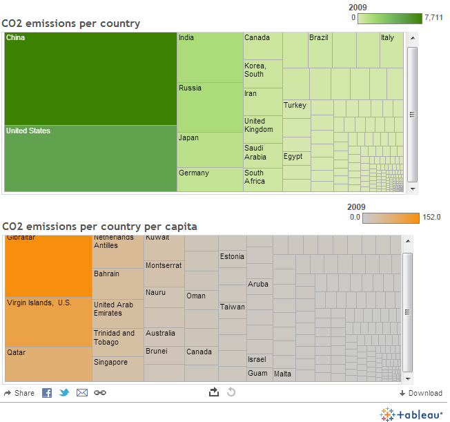
My first visualisation ever. Just tested a tool. It’s called Tableau Public and it’s free.

Could be better, but practice makes perfect as they usually say in these cases. TP is really cool. But I can’t embed it into this blog, because:

There is also a service called www.WordPress.com which lets you get started with a new and free WordPress-based blog, but it is less flexible than the WordPress you download and install yourself. Blogs hosted on WordPress.com do not take advantage of tools like Tableau that use JavaScript.

(TP FAQ)

OK. Here’s a screenshot preview.

Workbook  TEST

And here’s its interactive version.

And now I’ll go’ n’ kill myself.